| Back to January 21 | January 22, 2018
rudy@rugebregt.com |
On to January 23 |
About a month ago a helped a friend install a Roku streaming device. She's been a Netflix customer for quite a while and asked about the streaming service. I picked up a Roku stick and installed it before Christmas and gave her a quick overview. I started her on the the series "The Queen."
We met yesterday and she told me she was enjoying Netflix online but the Roku stick was puzzling and she didn't know what the icons meant. There was no real user manual or anything to help her get started. I explained the directional keypad, the OK button and the home button and that got her going.
So again it comes down to the assumptions you make when designing an interface. Roku comes at a time when many people have had computers, video games and smart phones. They assumed the navigation would be natural. And they are correct for the majority of their audience. Plug it in, watch a quick startup video and off you go. But for someone who grew up when a dial on a telephone and a column selector on a steering wheel represented user interface design the Roku was an entirely different language.
It's not that my friend isn't smart or that Roku has terrible design. Sometimes there's just a mismatch of experience vs. expectation. What I take exception to is the flip comment, "Oh they're just too old to get this" or "I don't undestand it so it's terrible design." As my friend so rightly said, "I'll just need to spend some time to learn what these icons mean and get not be so afraid to make mistakes."
I made a change on my page template today. Up until yesterday I was putting simple navigation on the bottom of the page. What I found was that I was scrolling to the bottom of the page to go to the next day. While this was better than entering each day in the address bar, I got tired of scrolling down. So I moved the navigation bar to the top of the page. Better.
I then asked Luann which she liked better. She suggested keeping the bottom navigation,
Building a user interface is hard. If done right, no one notices. The mark of good design is that if reveals itself naturally and doesn't distract from the content. I'm thinking about how to best find things on this site. I'm already finding myself searching page-by-page for samples I'm looking for. A local search engine would be nice. I'll look into it.
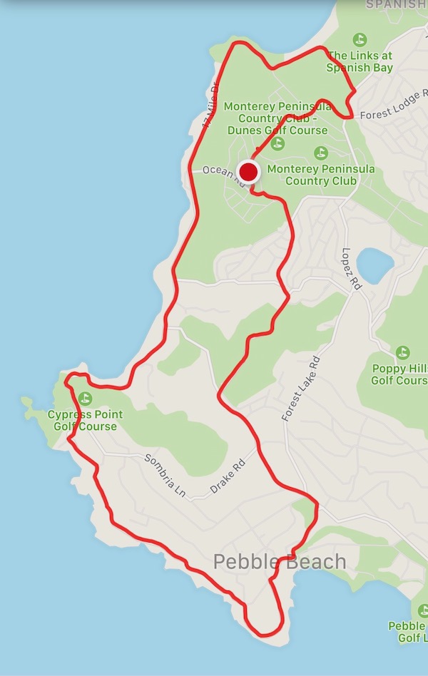
Pebble Beach 10 mile loop
I have it pretty good. From my garage I have a nice 10 mile bike loop that takes me to Spyglass Hill, Pebble Beach, Cypress Point, Spanish Bay and home. It takes me up into the forest and along one of the nicest stretches of coastline on the central coast. I'm planning to do a a GoPro video of the loop in the near future.
| Back to January 21 | January 22, 2018
rudy@rugebregt.com |
On to January 23 |